Wednesday, February 25, 2015

ESRI's Open Data vs.Data.gov

ESRI recently announced its open data website (http://opendata.arcgis.com/), which was in beta in mid-2014, so I decided it was a good time to take a look.  More and more open data is being published in a variety of places, by different organizations.

I thought it was only fair to make some comparisons. Because ESRI's user base and audiences are large, I decided the best comparison is Data.gov.  The only drawback is that Data.gov has been in existence longer.

Of course, open data is important regardless of the platform.  Moreover, open data can be imported into any free and open source GIS.
"[Open data's] impacts include... cost savings, efficiency, fuel for business, improved civic services, informed policy, performance planning, research and scientific discoveries, transparency and accountability, and increased public participation in the democratic dialogue." - Data.gov
One big difference between the sites is ESRI's contains lots of data from States vs. federal (state, and local) data found in Data.gov.  ESRI touts that it works with more than 380,000 organizations across the globe, so more open data is on its way!

A table comparing ESRI's Open Data vs. Data.gov
One big advantage of ESRI's Open Data page is being able to view geographic data in your browser immediately and even see some attribute data.

Data.gov's metrics pages are really neat including one on data sets published by agency by month: . Most data sets come from NOAA and USGS, which can be accessed in several different ways.   Obviously, a lot of the pages linked from Data.gov either use ESRI formats or are driven by ESRI products.  For developers it is also important to note that Data.gov has challenges/competitions. So be sure to check their website and social media! 

Data.gov helps you get started with browsing categories.
Currently, Data.gov has more data sets but it will be interesting to see how much ESRI can catch-up in the months to come.  It is a win-win situation for any data scientist or GIS analyst.  As open data sites get larger, they can become harder to search and navigate.  In sum, both sites will have to keep innovating to help bring out the best in open data and analysis.

Tuesday, February 17, 2015

SaTScan 9.4 released, better than ever!

SaTScan is a program for detecting clusters over space, time, and space-time.  It is available for Windows, Mac OS X, and Linux. SaTScan 9.4 was recently released and it is better than ever!  The data import wizard now allows shapefiles to be read and and a graphing feature has been added to help examine temporal trends. Visit the link for a better look at the rundown of new features.

The Import Wizard now reads shapefiles.
In previous posts, I've covered the types of files you will need and how to aggregate data in preparation for importing it. Since version 9.2, SaTScan has had the ability to export *.kml and *.shp so that the most likely clusters can be viewed in GIS software. (Aside: Google Earth Pro is now free! https://www.google.com/work/mapsearth/products/earthpro.html)

Below is an example looking at clusters of low immunization rates in California from the journal Pediatrics. Free full-text: http://pediatrics.aappublications.org/content/135/2/280.full.pdf+html

In SaTScan, using lat/long coordinates, allows users to export to *.kml and *.shp.
Google Earth opens the *.kml automatically when a run is complete.
A few tutorials are being made, http://www.satscan.org/tutorials.html and sample data is available. Be sure to read the expertly written user's guide before running: http://goo.gl/rHg7M6. and the long and varied bibliography of analyses conducted with SaTScan: http://www.satscan.org/references.html

Update #1 (2/20/15)
Scan statistics can also be implemented in R's Spatial Epi Package and rsatscan.

Wednesday, February 11, 2015

Mapping Data from Google's Global Database for Events, Language, and Tone (GDELT)

The Global Database for Events, Language, and Tone or GDELT Project supported by Google Ideas, monitors global media (in more than 100 languages) and identifies key people, locations, organizations, conflict, and themes. GDELT already has a lot of great features and is moving towards 2.0 with more contextualized geocoding.
"[GDELT's] Event Database archives contain nearly 400 million latitude/longitude geographic coordinates spanning over 12,900 days,...making it one of the largest open-access spatio-temporal datasets in existence." - GDELT website
Event vs. GKG databases
GDELT consists of two databases: 1) an Event and 2) Global Knowledge Graph (GKG) database. The event database is more focused on what and where, while the GKG focuses on 'how something is being said.  With the Event database, you can search by actor (initiator and victim) and by category of exchange / different type of event codes.  With the GKG, you can search by keyword.

One day's worth of events mapped above.  Click the map to enlarge it.
Accessing and downloading data
GDELT data can be accessed in a number of ways for a wide range of users from beginner's to advanced.  You can utilize the Analysis Service, Google Cloud, or raw data--in this case event data. A lot of the data sets are tab delimited.  Column names can be found in the documentation.  Skip to the bottom of this article for more links!

Analysis Service
I have spent most of my time exploring the analysis service that allows you to export raw data, map it, view timelines and a host of other great features. It provides all sorts of tools to access, export, and analyze data including creating heat maps, dynamic KMLs, timelines, network diagrams, graphs  tone graphs, and word clouds!

GDELT's Analysis Service makes the data very accessible.
There is too much to describe, so check it out for yourself by visiting the links below!  Be sure to read through the documentation before getting started!

GDELT Analysis
http://analysis.gdeltproject.org/

Raw Data
http://gdeltproject.org/#downloading
http://data.gdeltproject.org/events/index.html

Documentation and Column Names
http://gdeltproject.org/data.html#documentation
http://data.gdeltproject.org/documentation/GDELT-Data_Format_Codebook.pdf

Conflict Dashboard
http://gdeltproject.org/globaldashboard/

Sunday, February 1, 2015

Crime Analytics for Space-Time (CAST)

Crime Analytics for Space-Time (CAST) - alpha (2013) is a free and open-source cross-platform program (Windows, Mac OSX and Linux) designed "to detect spatial patterns and trends in crime data."

CAST is a nifty piece of software that combines key functions of other programs from the ASU GeoDA Center with a greater emphasis on temporal trends.  It even allows you to view data by calendar days, months, and years.

What you will need...
All you need is a shapefile of projected crime incident data and any boundary files (posts, census tracts, blocks, etc.).  To perform some types of cluster analysis, you will also need to aggregate your data.  If all you have is a *.csv, you can use QGIS to crate a shapefile file and save it for importing into CAST. There is sample data from San Francisco available here.

Check the format of your date field
If you are having trouble with using your data's date fields in CAST, use QGIS's field calculator to create a new variable with an output field type of "Date." Next, use "Conversions" and "to date" under the function list, and make sure the variable you enter is in the format "YYYY-MM-DD".  So, the expression should read:  todate( "Date Field" )
  • Make sure to create separate fields for date and time--rather than one single field. 
  • I tried a couple different formats but this format worked. 
  • In CAST, you will be able to select your date field. 
CAST can do a lot!
In the "Tools" menu, you can create a grid and save it as a shapefile.  Under "Table", you can view attribute data for your shapefile. The "Weights" menu allows you to create spatial weights and view a connectivity histogram, like in GeoDA.  The "Map" menu allows you to symbolize polygons by several different criteria.  The real fun comes in the last four menus: Calendar Map, Cluster Map, Time, and Explore.

Calendar Map + Dynamic Map
One of CAST's interesting features is combing a calendar with the number of events and a map.  You can add shapefiles and layer them, although a bit tricky by clicking on each. Below are few examples using homicide data from Open Data Philly.


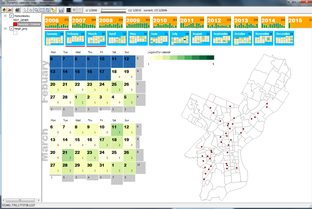
A calendar and map of homicides in Philadelphia starting in 2006.
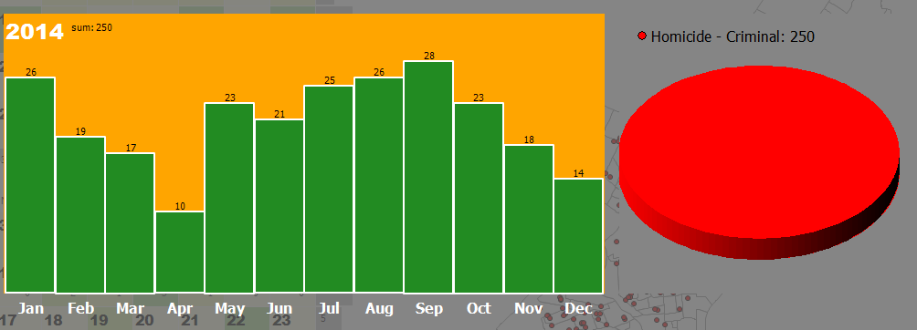
Clicking a calendar will bring up a bar and pie graph (which can show a
breakdown if there is more than one category of crime/event in your data).
Graphs and maps are linked in CAST, so clicking on a feature or peak in a graph will highlight the selected features.
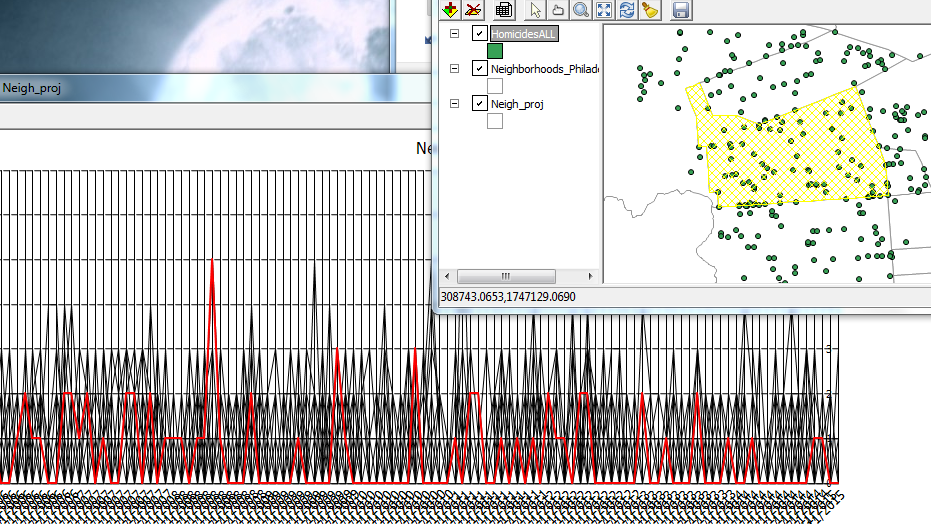
Like other ASU software, all graphs and maps are linked. Here one line was selected,
which represents one neighborhood, and the corresponding area on the map is highlighted.
Cluster Map
You will find a lot of tasks that are identical to GeoDA here plus some dynamic density maps.

Time & Explore
Trend graphs area available here as well as standard graphs like a histogram, scatterplot, and boxplots.

In sum...
Looking at patterns over space and time is difficult, but CAST can help.  Unfortunately, you cannot save a session in CAST so be sure to keep track of what steps you perform.  Limit your data to the time period of interest. I would not recommend adding huge point shapefiles.  Lastly, I was not able to save a movie/*.gif of animations over time, but if I figure it out, I will update this post.

For more information:
CAST Manual